Making The Most Of Your Mobile Phone Camera
I was at a wedding last week, when one of the guests handed me his phone, and asked if I would take a photo of him, his girlfiend and another couple. After the usual hilarious banter about the photographer being asked to put his camera down and take a shot on someone’s phone, I asked them to move a little, into the shade, to which one of the girls looked unhappy. “I prefer the light here” she said. Her partner pointed out “this guy knows what he’s doing” and they moved. I very quickly took 2 or 3 shots and handed the phone back. “Jesus, this is amazing” he said. Showed it to his girlfriend who gave a “wow, that’s the best photo of us ever”. Job done.
However, what had I done? Well, to be honest, absolutely nothing. Which brings me the the point of this. It is most definitely NOT about the camera. An expensive camera is lovely to have.I have talked before about the importance of the eye over the expensive equipment. It opens up creative options, but you CAN take great images on your mobile device. So how can I take better images on my phone (or on someone elses phone) than the average person? Simple answer – using my eyes and not the camera. So, I have decided to put together a dummies guide, so to speak, for taking better pictures on your mobile device. I am starting off today with the most common thing I see wrong with mobile photos. Composition. Composition is a big topic, so I am just going to cover a couple of simple elements today. Simple but important tips.
Composition is all about taking a few seconds to think before you press the button. Often the difference between a photographer and a ‘snapper’ is just that – the thought process. Can I improve this photo just by taking a step closer, a step back. Can I get lower or higher and improve the dynamics of it? I see people at events, holding their phone out just grabbing anything. I can tell they aren’t even holding the camera/device level. Quirky photos at 45 degree angles were trendy back about 20 years ago I was doing it all the time at weddings, but not now. The horizon should be level, especially for landscape photography. I see many, many pictures where someone has just got out of the car, stepped outside and taken a photo of a scene, and often it isn’t that bad, except the horizon is at a weird angle. So first thing to look at is the horizon. Very basic, but probably the most common mistake I see. Think/look before you click.
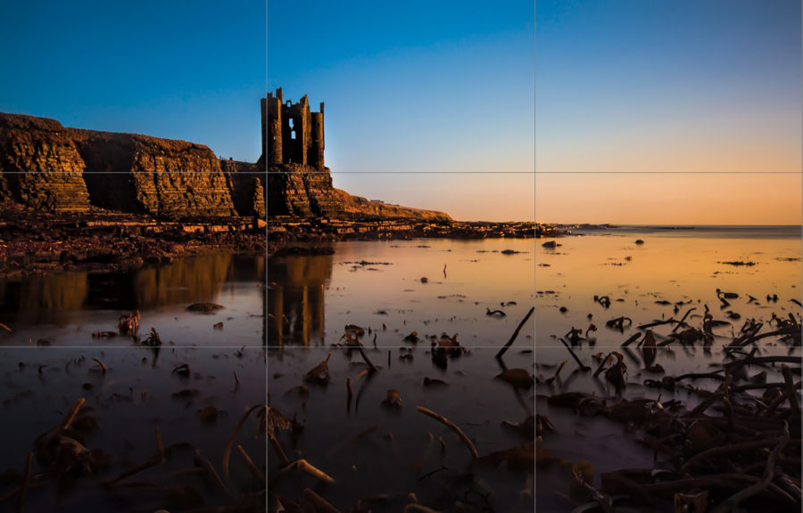
Next up, the positioning of your subject in the frame. The subject or main focal point does not have to be in the centre. Try to use the rule of thirds. The rule of thirds involves an imaginary set of lines dividing your scene into 3, vertically and horizontally. You want to place the main focal point on one of these lines, or the intersection of two of them. This simple ‘rule’ can make an otherwise quite ordinary image, a much more eyecatching picture, whether it is landscapes, portraits or any other subject. Give it a try and see what you think.
So simple advice, and it all comes down to just taking one or two seconds longer to look at what you are taking. The beauty of digital is, you can see the image before you take it.
